Colour glass splashbacks can change the feel of a kitchen faster than almost any other surface. They protect the wall, reflect light, and add a clean modern finish that suits both small and large spaces.
The big decision is usually whether to go neutral or bold. Each direction can look amazing, but the right choice depends on your kitchen layout, lighting, and how long you want the style to last.
When neutrals create the best result
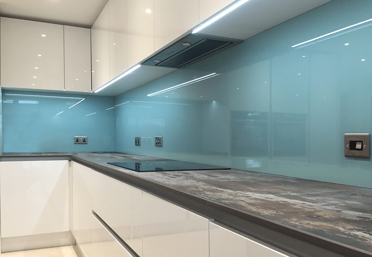
When choosing colour glass splashbacks, neutrals are often the safest option for long term value. Soft whites, warm creams, greys, taupe, and gentle beige shades work with most cabinets and worktops.
Neutral colours also help the kitchen feel calmer and more spacious. This is helpful in compact rooms where strong colour could make the walls feel closer.
If your worktop has pattern, such as marble effect, speckled stone, or busy veining, a neutral splashback usually looks more balanced. It supports the worktop rather than competing with it.
Neutrals are also easier to update around. If you later change handles, appliances, or wall paint, a neutral splashback is less likely to clash.
For modern minimal kitchens, a tone on tone approach looks especially refined. Matching the splashback closely to the worktop or cabinets can create a seamless, high end look.
When bold colours make more sense

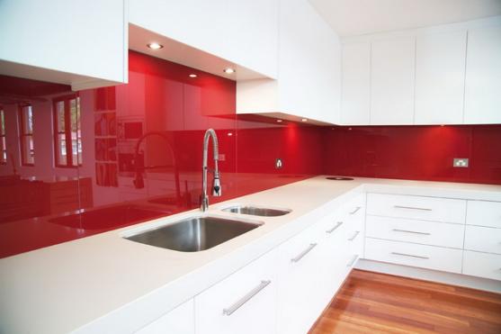
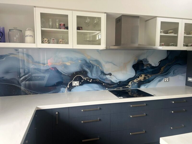
Bold colour can be the best option when the kitchen needs a clear focal point. If cabinets and worktops are plain, strong colour glass can bring depth and personality without adding clutter.
Deep navy, forest green, charcoal, and even rich terracotta can look striking in modern homes. These shades pair well with light cabinetry, warm wood, and metallic finishes.
Bold choices also work well in open plan spaces, where the kitchen needs to hold its own visually. A strong splashback colour can help define the kitchen zone and make it feel intentional.
Lighting should guide the choice here. Under cabinet LEDs can intensify bold colours, so it is smart to test a sample in both daylight and evening light.
If you love trends, you can still go bold but aim for shades that feel timeless. Dark green, deep blue, and soft black tend to stay stylish longer than very bright colours.
How to decide quickly and avoid regrets
The easiest way to decide is to look at what is already fixed in the kitchen. Worktops, floor tiles, and large appliances are harder to change, so the splashback should fit around them.
For colour glass splashbacks, check undertones rather than the main shade alone. A grey can be cool and blue based or warm and earthy, and that difference affects how it sits beside wood and stone.
Think about cleaning habits and visual noise. Very light colours can show marks from cooking, while very dark colours can show dust and water spots depending on the finish.
Also consider resale and flexibility. If you plan to move within a few years, neutrals are generally easier for buyers to accept.
If you plan to stay long term, choose what you truly enjoy daily. A bold splashback can feel like a design statement that makes the kitchen more personal and less generic.
Conclusion
Colour glass splashbacks look best when they support the kitchen rather than fight it. Neutrals offer flexibility and a calm, timeless feel, while bold colours bring character and create a strong focal point.
By checking undertones, testing samples under real lighting, and thinking about the fixed surfaces in the room, you can pick the right direction with confidence. The result is a splashback that feels intentional, modern, and easy to live with.